


Last time, we looked at how county property tax bills have changed over the last 10 years and some of the underlying causes of that change.

Today, we’re looking at how those same forces have impacted the approximately 60% of North Carolinians who live inside an incorporated city or town. Because if you live inside the city limits, the county taxes may only be half (or less) of what you pay every year.
Tax Rates’ Secondary Role
To start, let’s look at how the actual tax rate factors into your bill. When we looked at the county tax rates, what we found was that the actual tax rate was relatively unimportant in determining what you actually pay relative to the value of your home. The same holds true when you look at municipal taxes. The chart below plots the combined (county + city) change in the tax rate against the change in the estimated combined bill for each city and town in the state.
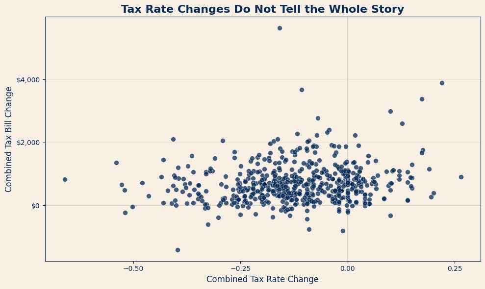
You’ll note that the dots form a giant blob, suggesting that there is very little relationship between the change in the tax rate and the change in the tax bill. You can see dots where the tax rate was cut substantially (more than 25 cents), and yet the tax bill increased by more than $2000. On the other hand, you can see places where the tax rate increased, and the effect was a negligible increase (or even a decrease) in the tax bill.
Put simply, knowing whether the tax rate went up or down tells you surprisingly little about what happened to the typical homeowner’s bill.
Watch Your Home Value
Contrast that with the relationship between the median home value and the tax bill, and the relationship is much clearer:
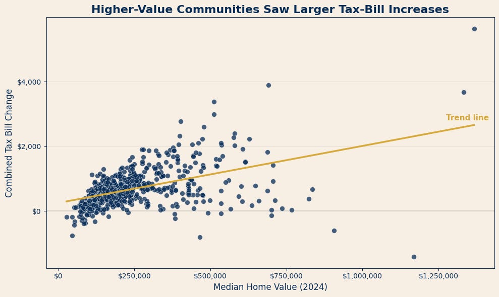
Municipalities with higher median home values generally experienced larger dollar increases in their estimated combined tax bills.
Part of that relationship is mathematical. Because the tax rate is applied to the assessed value of the property, changes in rates or values generally translate into larger dollar amounts on more expensive homes. A 25% increase on a $500,000 home adds much more taxable value than the same increase on a $150,000 home.
This does not mean that every high-value municipality experienced a large tax increase—the chart includes several notable exceptions—but home value is clearly more closely associated with the size of the bill increase than the tax-rate change alone.
Do Cities Follow Counties?
Another interesting question to consider is the relationship between city and county taxes. If a county raises taxes, how do the cities and towns in that county respond? The relationship is striking. The chart below compares the average change in county tax bills with the average change in municipal tax bills for the cities and towns within each county1. You can see that as county bills rise, so do city and town bills:
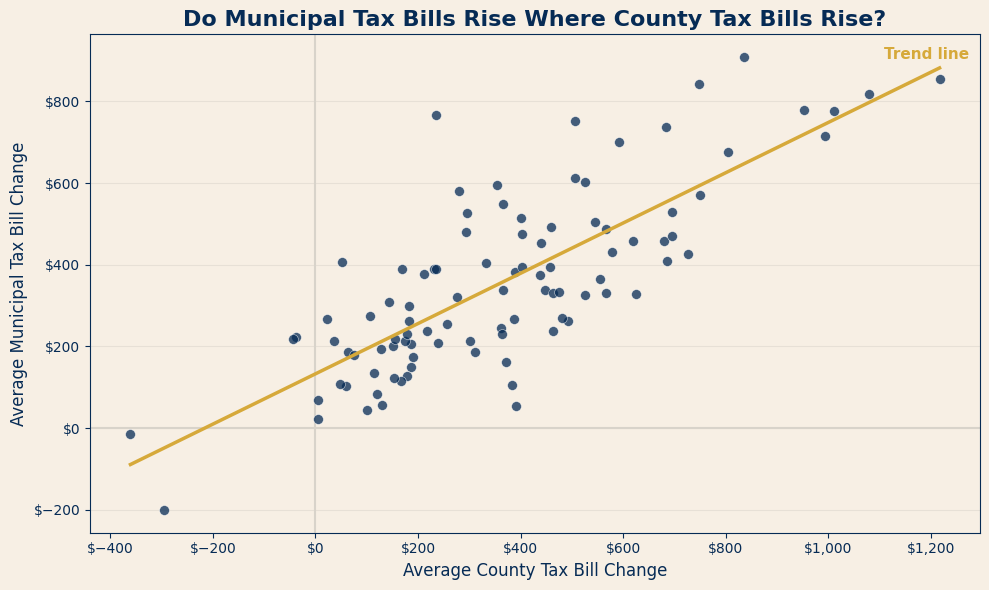
Counties with the largest increases generally also contain cities and towns with some of the largest increases. Obviously, not every municipality is following its county precisely (and you can see that variation around the trend line in the chart). However, the relationship here is much stronger than the one we saw between tax rates and tax bills.
If you want to get an idea of where your city tax bill is likely headed, there are two numbers to look at: the value of your home (particularly if you have gone through a re-val) and your county tax bill. My suspicion is that some of this is political. When a county approves a sizable tax increase, it may create a kind of “safe space” for the municipalities within it. City and town officials may be reluctant to exceed the county’s increase, but may be more comfortable approving an increase in the same general range.
There are less political explanations as well. A county and the municipalities within it are generally operating within the same housing market, revaluation cycle and regional economy. They may also be confronting similar pressures involving wages, construction costs, population growth and demand for services.
The chart tells us that county and municipal bills tend to move together. It cannot tell us exactly why—but the relationship is strong enough that your county tax bill may be a useful indicator of where your municipal bill is headed.
Where Does Your City Fall?
There are more than 540 municipalities in North Carolina, and I have all of their tax bill changes loaded into the map below. Larger circles represent larger increases, while the colors divide municipalities into five groups based on the size of the increase. The darkest blue represents the highest 20% of municipalities, while the lightest blue represents the lowest 20%. You can zoom in to compare how your city ranks relative to the cities and towns around it.
This table shows the 10 municipalities with the highest estimated combined county-and-municipal tax bills on a median-valued home. Each city-and-county combination is treated separately, so Chapel Hill appears twice because portions of the town are located in both Orange and Durham counties.:
On to Affordability
We’ve looked at how the size of property tax bills across the state has changed over the last 10 years, but what about people’s ability to pay them? After all, a $500 increase in one family’s tax bill might be an inconvenience, while that same increase for another family might be the difference in whether they stay in their home. Next, we’re going to look at how changes in income factor into all of this—and where property taxes may be becoming less affordable.
Calculated as the average of the median tax bills in each city or town with the county