


Previously, we looked at trends in property tax rates and how rising home values have pushed tax bills higher across the state. Today, we’re looking at how all of that plays into the key question of whether property taxes in North Carolina are affordable and whether that affordability is getting better or worse over time.
Taxes Went Up, but Did Income?
For this analysis, I define affordability as the estimated county property tax bill relative to median household income. This looks only at county property taxes, so it does not include the additional municipal taxes paid by people who live inside a city or town.
Since taxes are paid with income, it makes sense to look at how income has changed relative to tax bills. What I’ve done in the chart below is place each county based on how much the estimated county tax bill changed from 2016 to 2025 and compare that with how much median household income changed over roughly the same period (per the Census)1. The results are surprising:
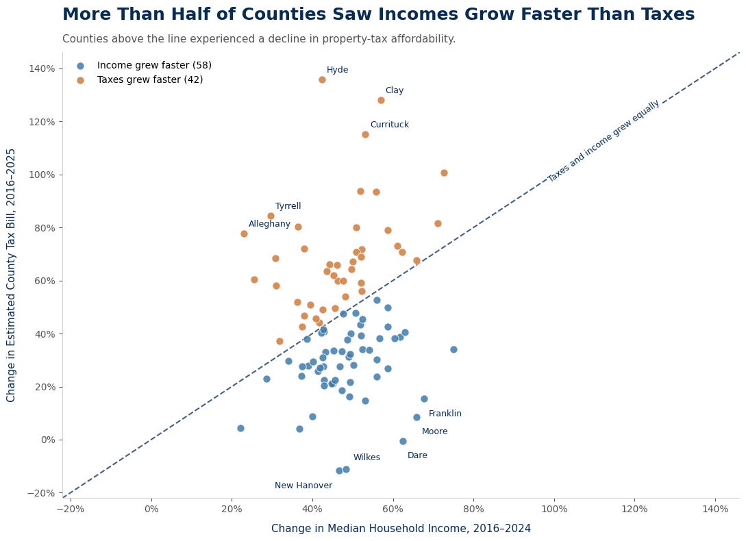
The farther away you get from the line, the more income growth either exceeded tax-bill growth (for the blue dots) or fell behind it (for the orange dots). You can see that there are quite a few orange dots well above the dotted line, and these are the counties where affordability has been most stressed (all else being equal). Overall however, 58 of the state’s 100 counties saw incomes grow faster than their estimated tax bills.
The Role of Growth
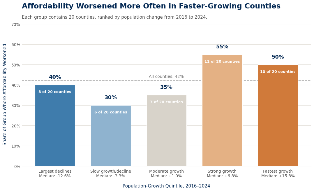
But what makes a county an orange county? One of the common themes is fast growth. If you divide all 100 counties into five different buckets based on how quickly their populations grew from 2016 to 2024, you’ll find that if you are in one of the faster-growing counties, you have a greater than 50% chance of being an orange dot. If you are in a slower-growth county, your chance of being an orange dot is less than 40%. That doesn’t necessarily mean fast growth caused affordability to worsen. It does reinforce the idea, however, that just because an area is growing quickly and building lots of houses doesn’t mean that it is awash in cash.
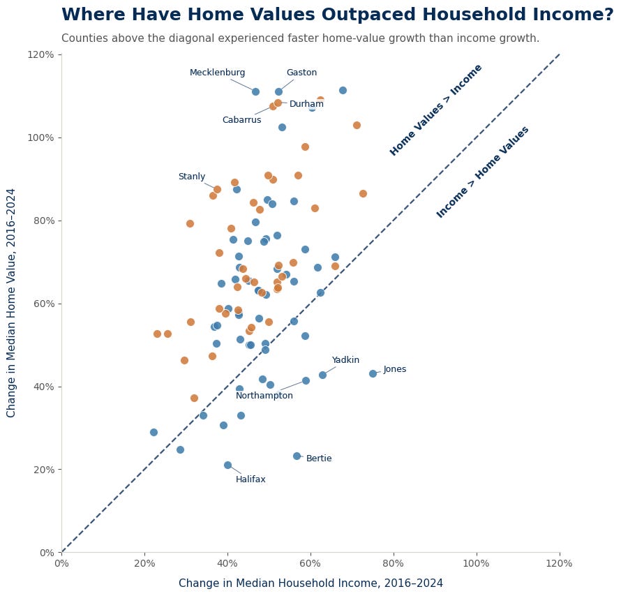
How does housing affordability play into this? The answer to that is actually fairly complicated. In every county where income growth exceeded home-value growth, the county was a blue county (i.e. tax affordability improved). In the counties where home-value growth exceeded income growth, there was no clear pattern as to whether a county was more likely to be a blue county or an orange county, even at the extremes. Consider Gaston and Mecklenburg counties, which had some of the highest home-value growth in the state, but still managed to remain blue counties (meaning income outpaced estimated tax bills):
If we do the same exercise as we did above and divide the 100 counties into five different groups, but this time based on home value appreciation, the clearest differences emerge at the two ends of the scale:
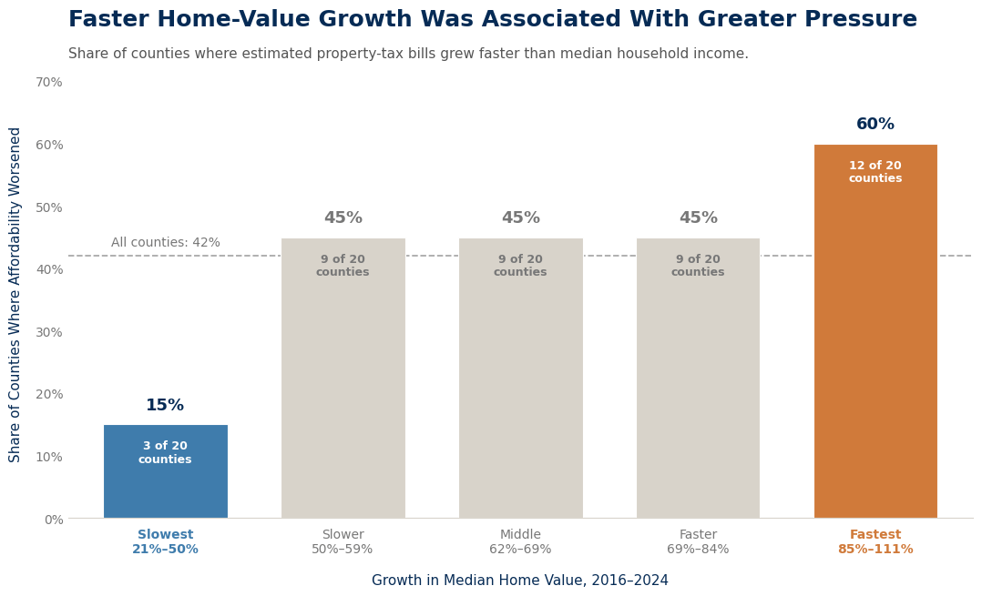
The counties with the fastest home-value appreciation were the most likely to have an affordability problem, while those with the slowest appreciation were the least likely. The three groups in the middle all came in at 45%, so there was no consistent pattern among them. At the extremes, however, 60% of the fastest-appreciating counties were orange dots, compared with only 15% of the counties with the slowest home-value growth. It is worth pointing out that even among the fastest-appreciating counties, 40% still managed to avoid a deterioration in affordability.
What Is an Affordablility-Preserving Tax Rate?
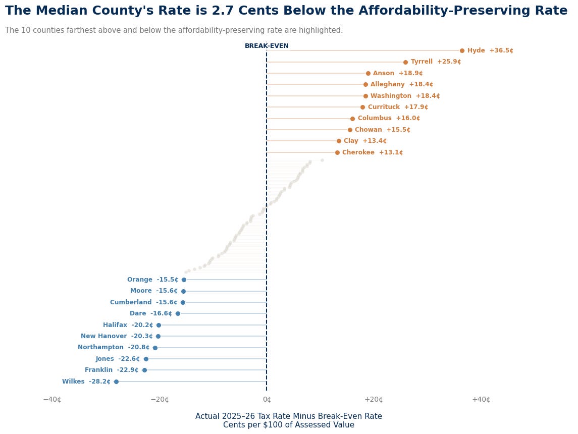
One final way of looking at this is by trying to estimate what tax rate would have kept tax affordability constant over the ten-year period. For example, if you paid 1% of your income in property taxes in 2016, what tax rate would the county have needed to set in order to keep your property taxes at 1% of your income in 2025? Again- the answer is surprising.
Across the entire state, the median county set a tax rate 2.7 cents below the rate necessary to preserve affordability. Continuing with our example above, if the county needed to set a tax rate of 50 cents in order to preserve affordability, the median county set the tax rate at 47.3 cents, suggesting that tax affordability actually stayed stable or improved slightly in the typical county. There are however, several notable exceptions, which you can see in the chart below. The chart shows how much each county is either over or under the affordability-preserving rate:
A Tally of the Counties
As you can see, the question of affordability quickly gets very complicated. The chart below attempts to make some sense of it by showing the individual metrics for everything I discussed above for each county. Blue corresponds to improving affordability, while orange corresponds to deteriorating affordability. The visualization is sorted by the change in the tax burden, which is the measure of estimated taxes paid relative to income.
You can see how counties with high home-value growth (like Franklin) managed to reduce their tax burden through a combination of lower tax rates and higher income growth. At the opposite end of the scale, you can also find examples of counties where home values did not pop nearly as much, but the tax burden increased due to a combination of tax rate increases and slower income growth.
What’s clear is that there is no silver bullet to solving the issue of property tax affordability. What is key to supporting long-term affordability is the nurturing of a local economy that sees steady, but not excessive, population growth over time along with a healthy job market that supports consistent wage growth. Rapid growth can create additional demand for local services, but it can also expand the tax base. Rising home values can push tax bills higher, but counties can offset some of that increase by lowering tax rates. Likewise, consistent income growth gives households more room to absorb rising housing costs. Figuring out how to balance those competing forces is much more important to the long-term affordability of your property taxes than the any single year’s change in the tax rate.
Census data is only available through 2024, so the change in income ends one year earlier than the change in estimated tax bills. Given recent income trends that likely slightly understates the size of the increase in income, but it shouldn’t be meaningful here.